- Despite downloads, many never reached the Aha moment.
Just a highly driven product designer with personality of a social butterfly. Addicted to product validation. mentoring passionate rookies. Managing multiple design teams. Best wingman for Sales calls
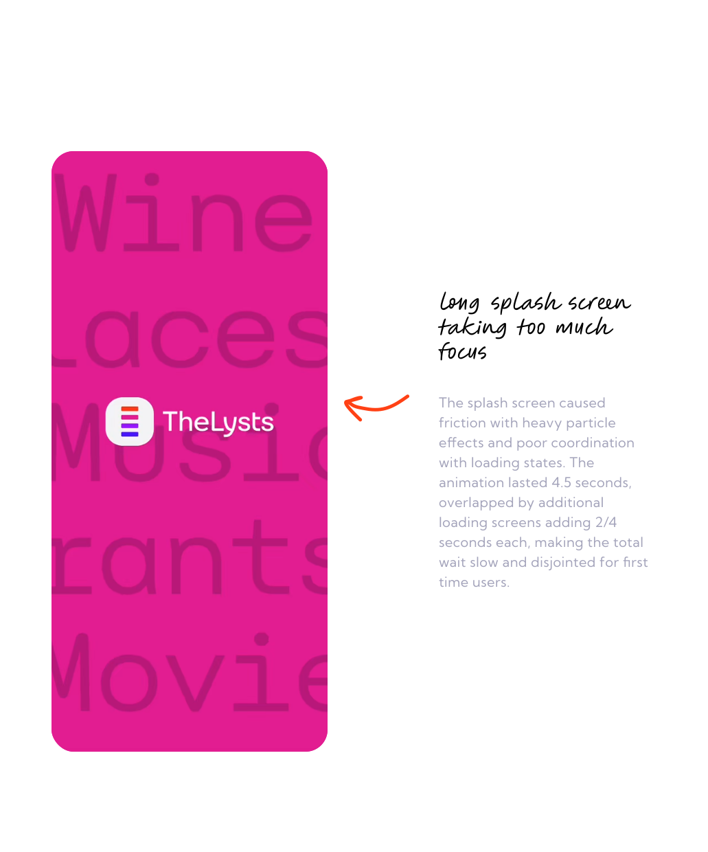
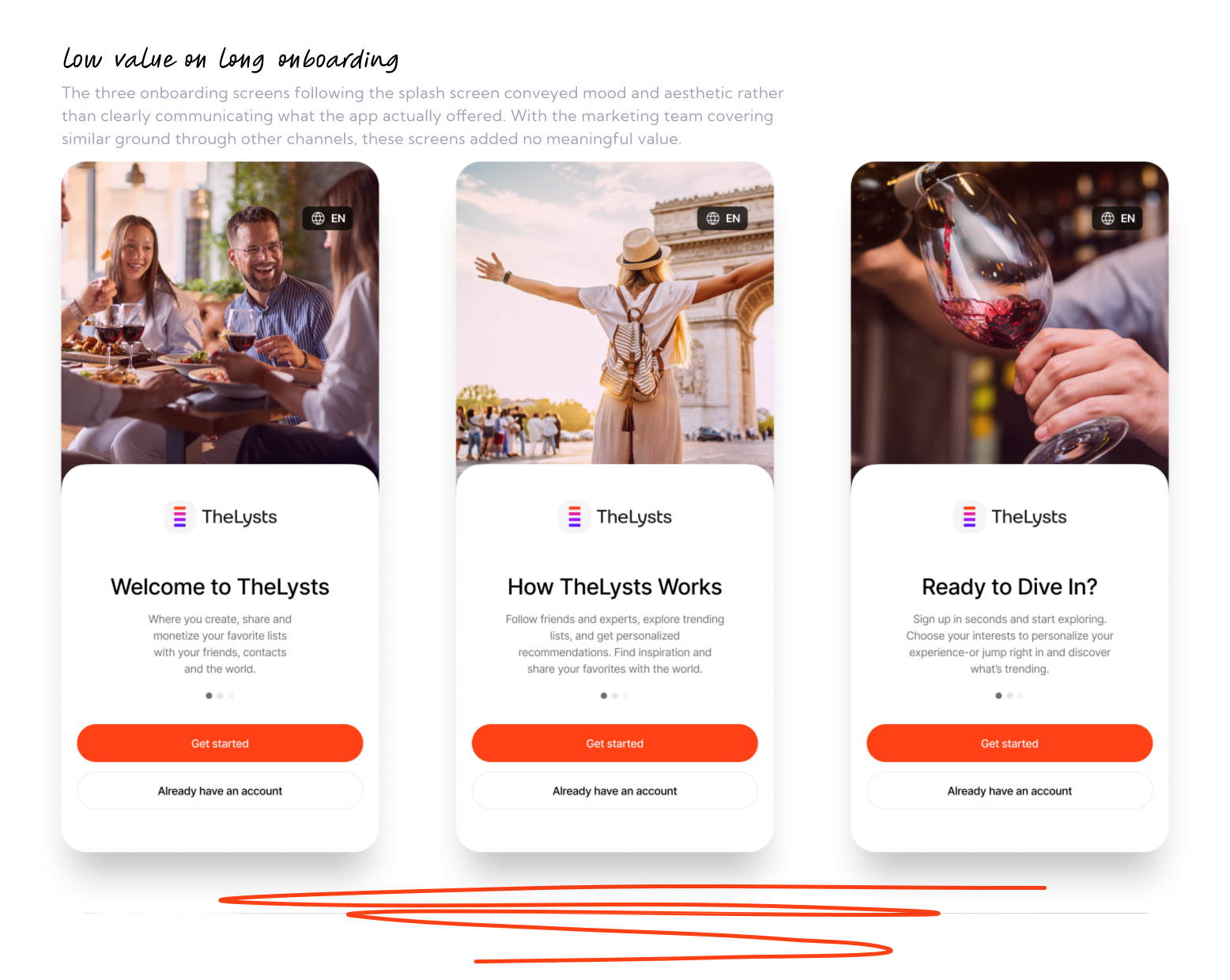
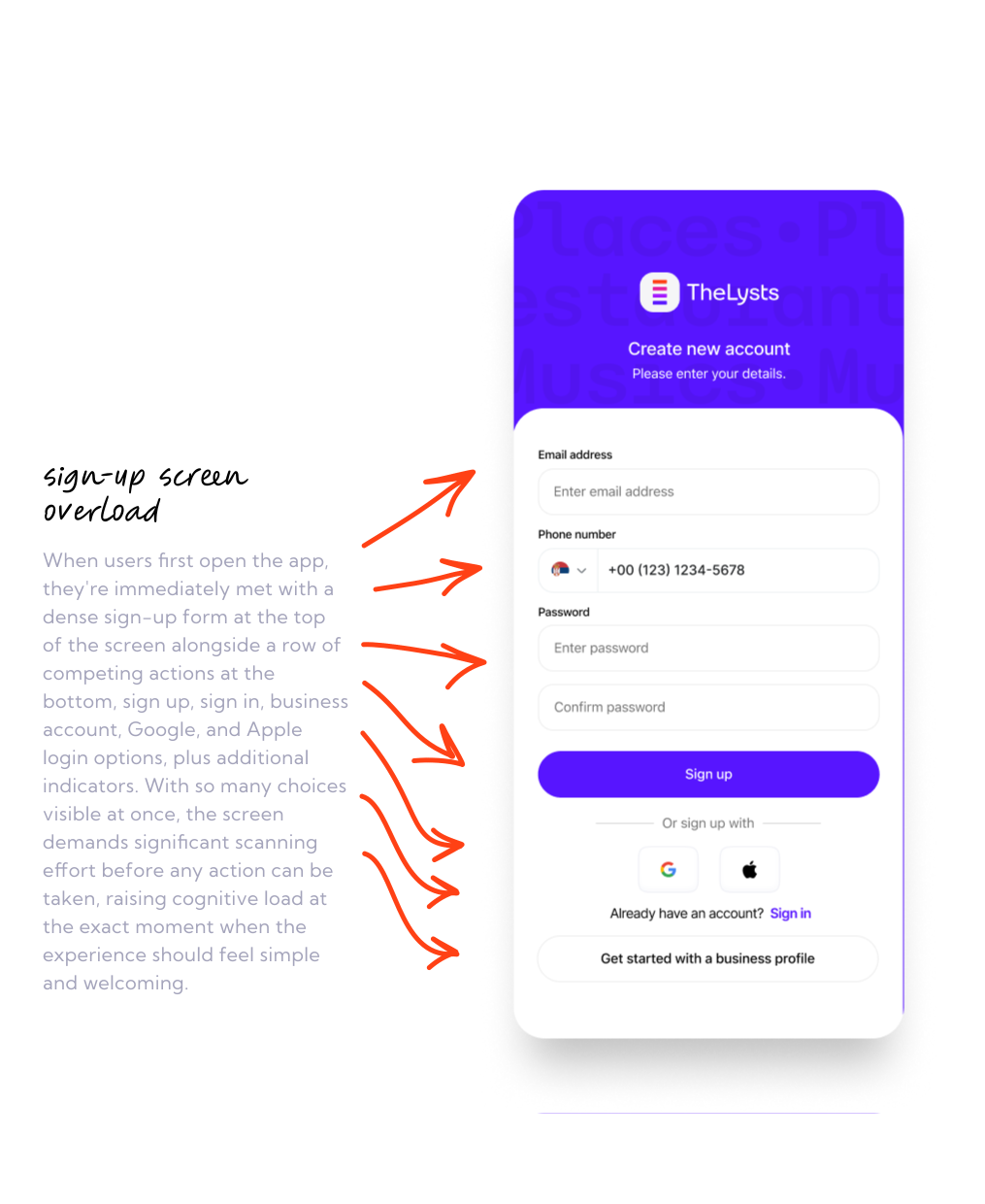
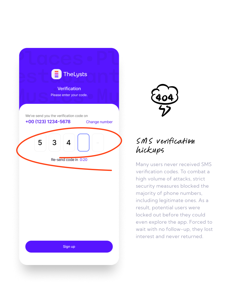
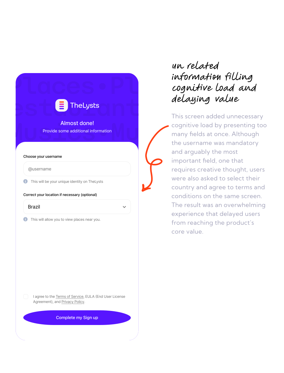
Before users could see a single list, they had to work their way through a long onboarding process. Security requirements, verification steps, and mandatory setup screens stood between users and the reason they downloaded the app in the first place.
- SMS verification frequently failed
- Mandatory setup steps delayed access
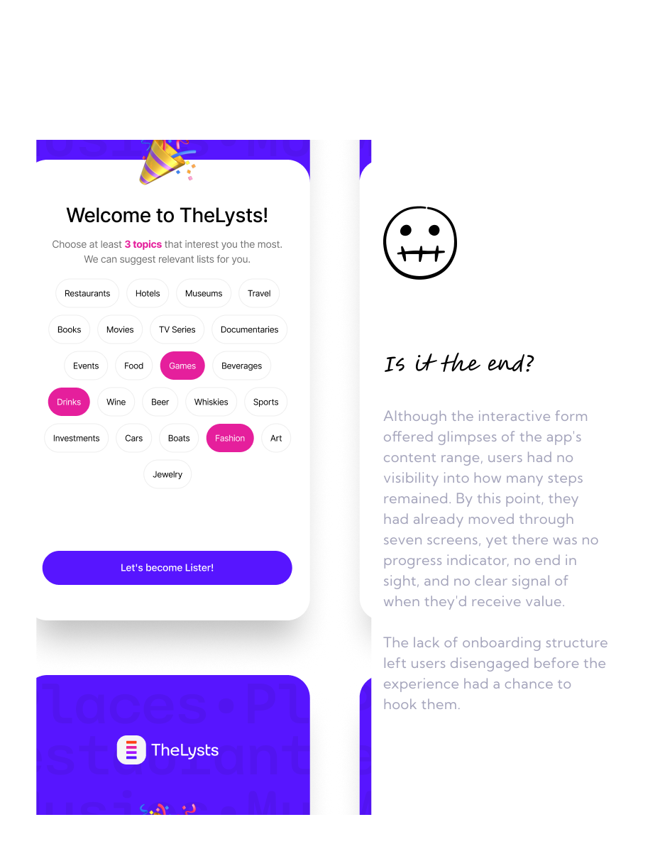
- Introductory screens provided little value
- Users didn’t know how much onboarding remained
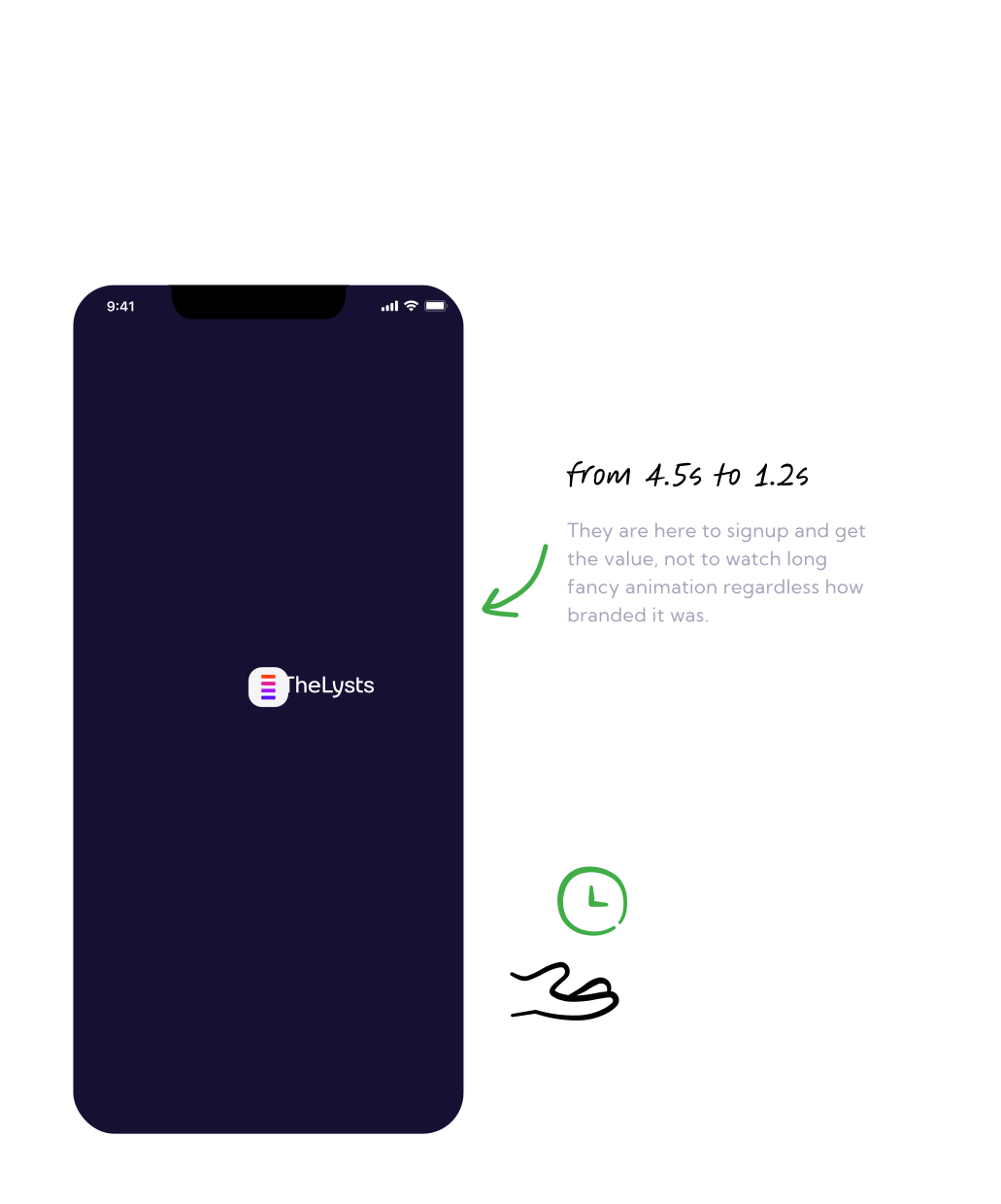
- Too much time before reaching value
Before
- A Theory Worth Testing
My hypothesis was that users weren’t rejecting the platform, they simply weren’t reaching the moment where its value became clear. If we could reduce the path to first value, more users would continue into the experience.
The AHA moment happened when users discovered a list that resonated with them or realized they could start building their own. Unfortunately, onboarding was asking users to solve problems they didn’t come for (verification, setup, and configuration) before they could experience the reason they downloaded the app in the first place.
- The Simplest Solution
Instead of optimizing individual screens, I redesigned the entire activation path. The redesign focused on one principle: Reduce the time between app install and first homepage view.
So strategy was:
Reduce steps from 8 to 3 | remove sms and rely on googles and apples verification | leave email and pass only for users who already had account | ask only for username and leave the rest when they get value
After
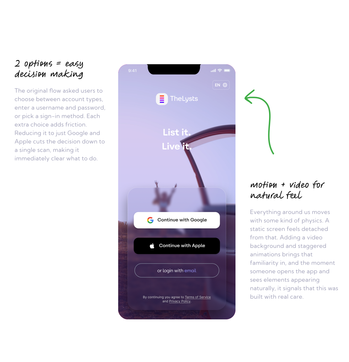
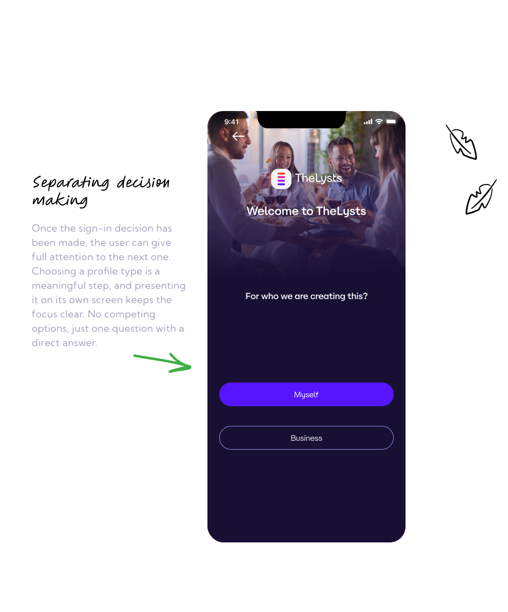
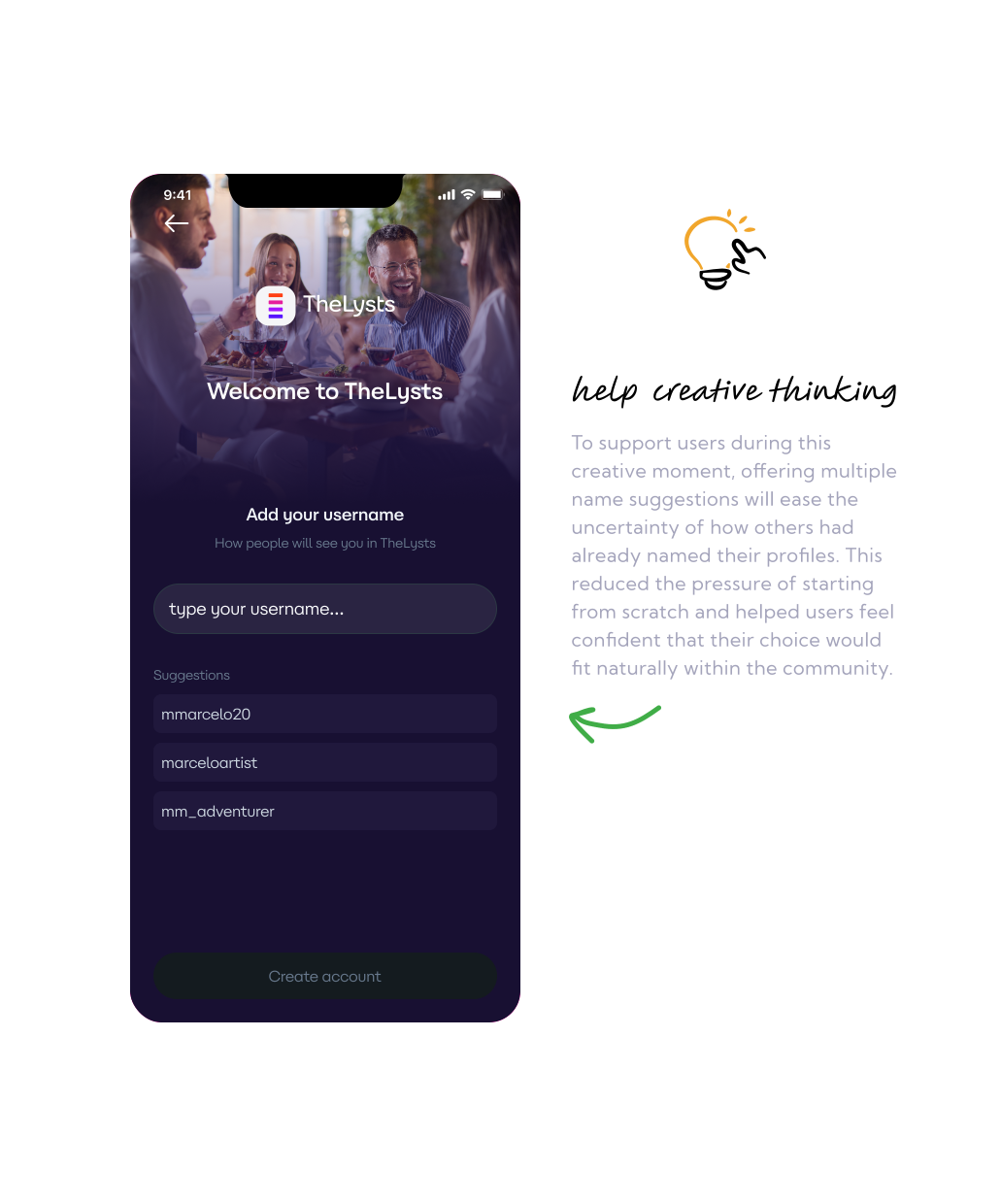
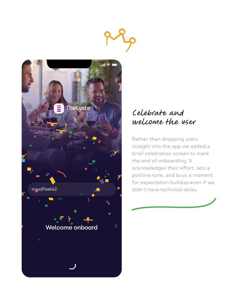
- What Needed to Happen
I setup clear goals, if users completing onboarding
- Smaller gap between installs and new users with 1st homepage view, not less than 40% in first month.
- Also, we wanted to monitor active users and see if their activity went up after this changes, altho we knew we have to fix more issues in post-signup flow first.
Metric were defined sole by comparing effects we would get from campaigns.
On the other hand, killing the test would happened if we did not see any changes in downloads vs new users who saw the homepage gap grater than 10%. Gap was big and we knew it can be smaller.
If users continued abandoning before reaching the homepage In that scenario, the root cause would likely be elsewhere and we would do more live user testing.
- The Outcome
Success!
After launch on April 15, 2026: Month over month on New users who saw homepage increased by almost 36% Active users increased by 13.0%. The onboarding journey was reduced from approximately 8 screens to 3. The results supported the original hypothesis: reducing activation friction helped more users reach the product experience.