A brand recovery that never made it to launch, but still did its job.
Project overview
Spiroflex makes high-tech bellows, and came in needing more of a reset than a simple redesign. Working alongside a partner marketing agency handling the marketing side, the project started with a recovery workshop to get the brand and business goals back in sync before any design work began.
Role
From there, I designed the website itself. It never made it to a live launch, but the groundwork done in that recovery phase, getting clarity on what the brand actually needed to say and who it needed to say it to, was real work worth showing.
Carts Guru – Email Marketing Automation
Years of listening to users and turning it into features that mattered.
Project overview
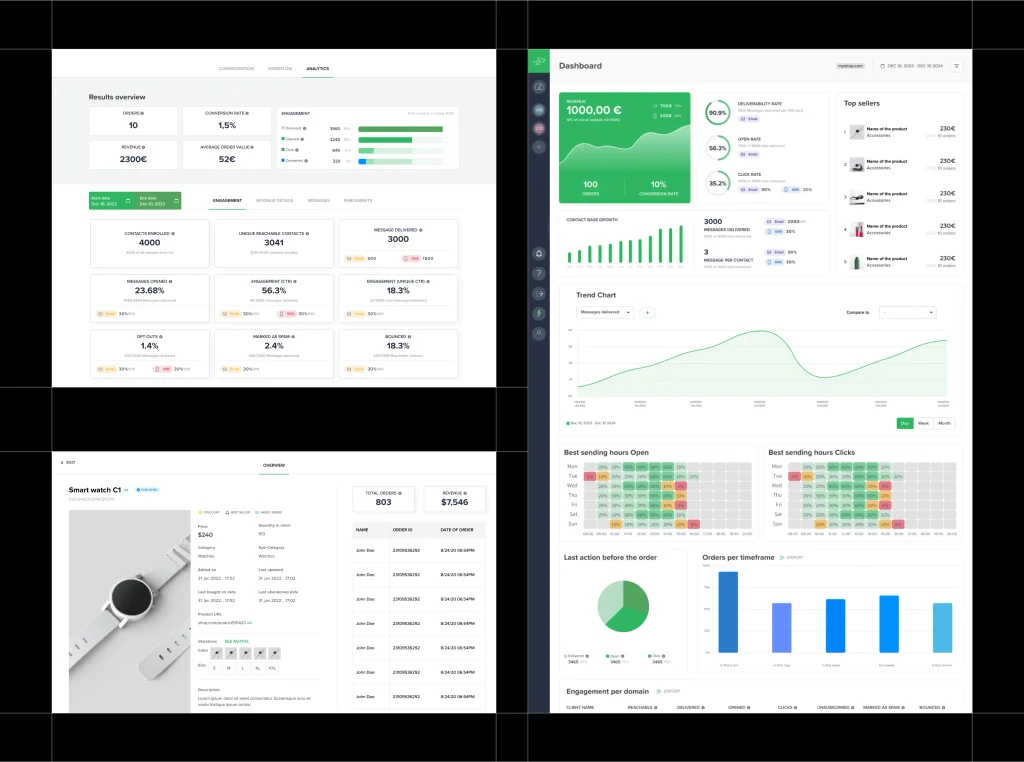
Carts Guru is a marketing automation platform for online stores, similar in spirit to tools like Klaviyo, built around helping stores create and manage email and SMS campaigns that actually move sales.
Role
I worked with them as a product design consultant over several years, moving through many redesigns and new features as the product grew. A lot of that work came directly from user feedback: figuring out what people were actually struggling with and turning that into decisions about what to build next, not just how it should look.
Boxara – Hand Crafted 3D Frames
Rebuilding an online store around the story of the product.
Project overview
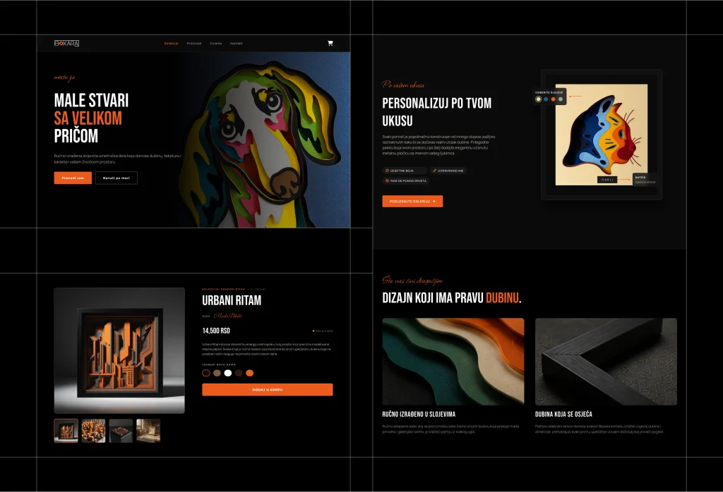
Boxara makes handcrafted 3D paper art: framed pieces built from paper, ornaments, and small figures, somewhere between a gift and a piece of interior decor. They already had a website, but it was unfinished, and the products were not presented in a way that made sense of what they actually were.
Role
I took this on as developer, designer, and ongoing growth consultant. That started with restructuring the WordPress and WooCommerce setup and completely redesigning how the products were presented, and it has continued since as an ongoing relationship where I keep tracking and adjusting the store’s growth plan.
Cinnamon
Ruining homepage to increase engagement
01 / The Problem
Everything was there. That was the problem.
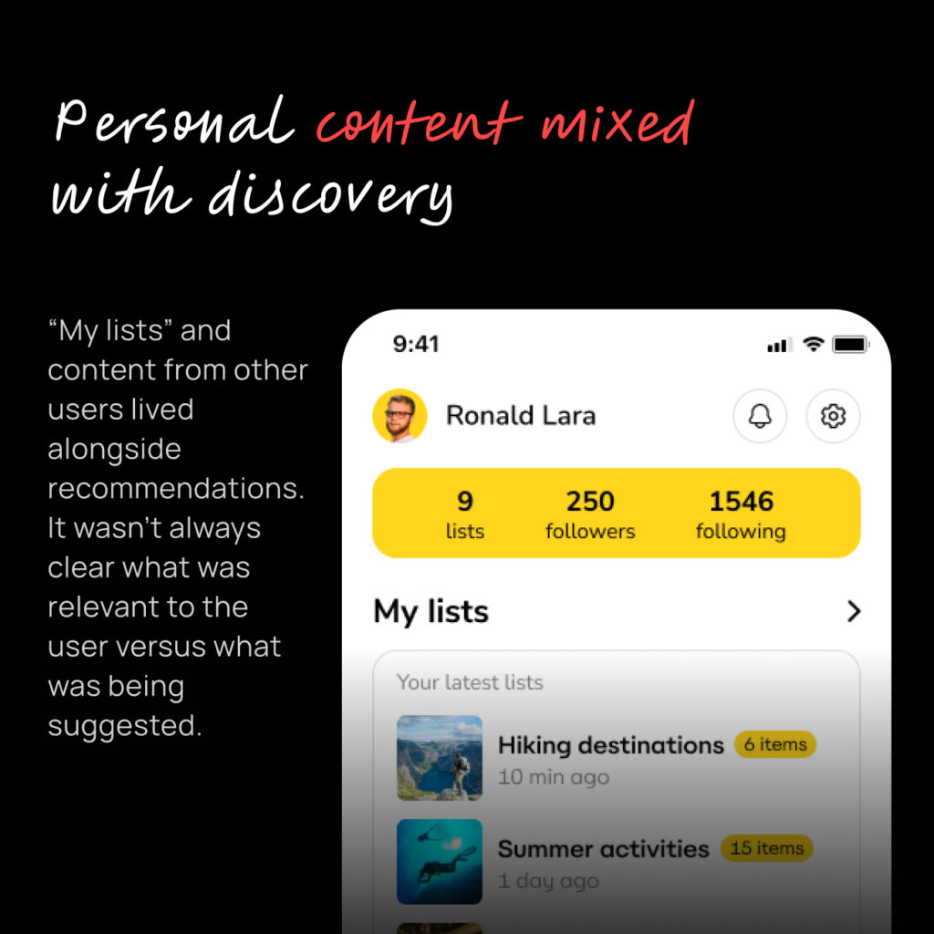
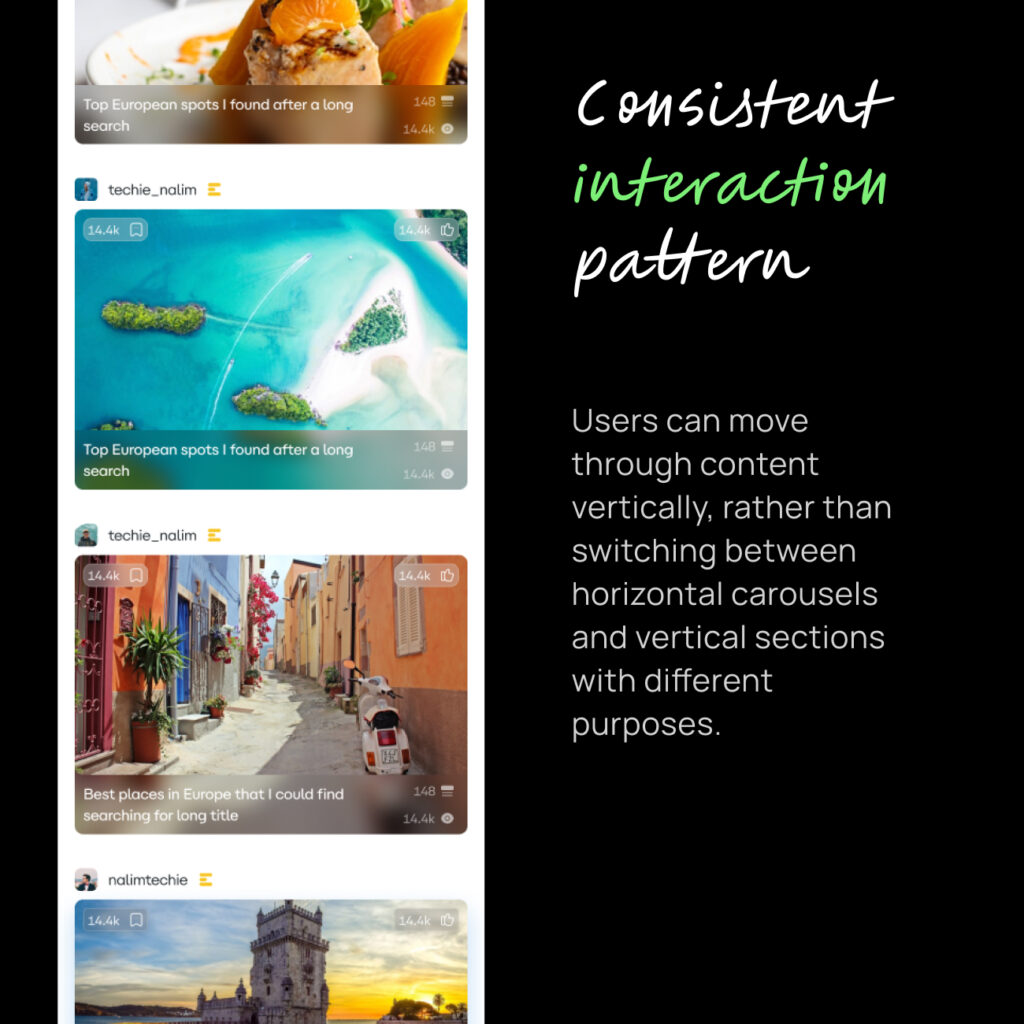
content from people and lists you followed
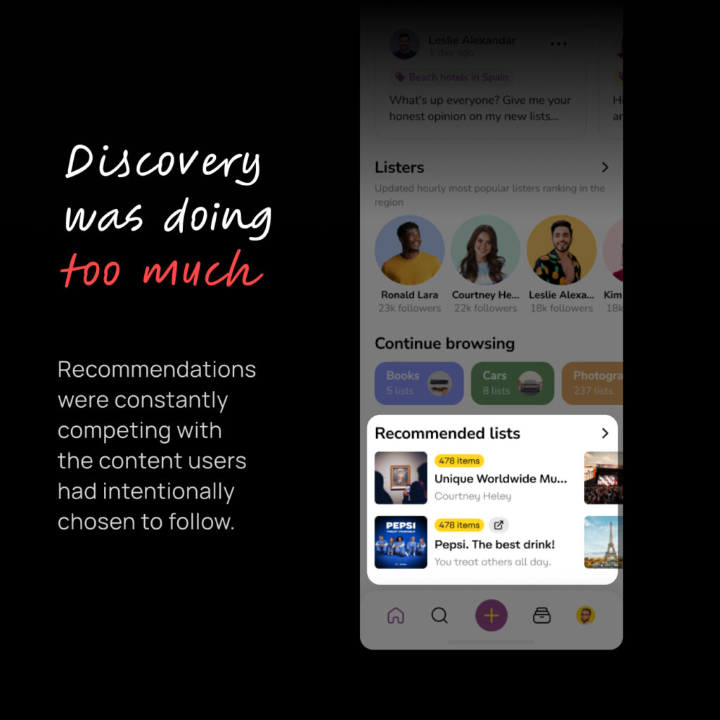
recommendations
your own content
discovery
search
topics and filters
different types of content
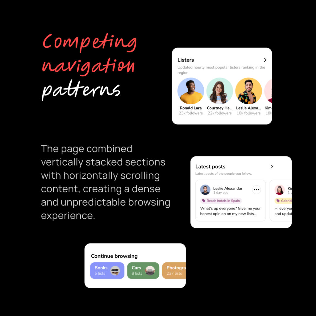
horizontal and vertical scrolling
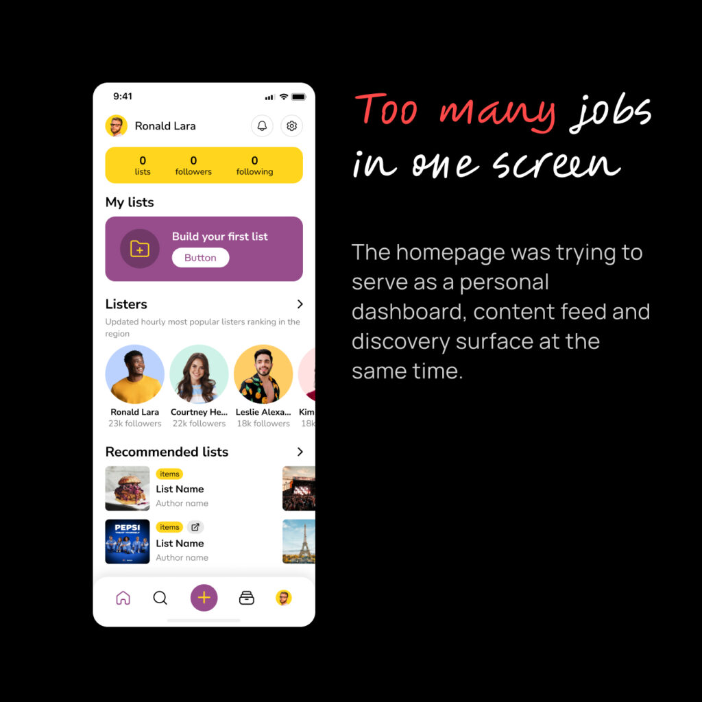
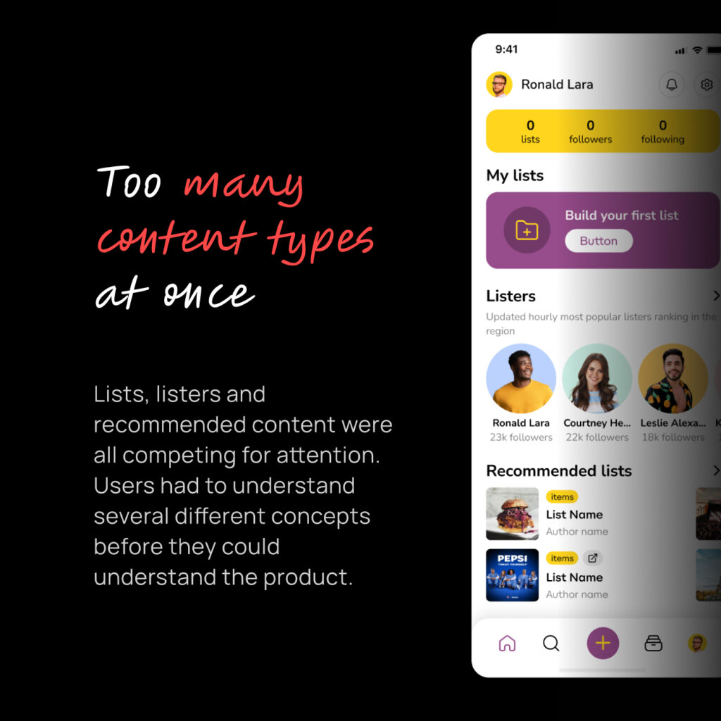
The Lysts homepage had grown into a place where users could do almost everything at once.
Nothing was necessarily wrong with any individual feature.
The problem was how they all worked together. Especially for users entering app for the first time. For them, seeing screen with multiple actions potentially can only leave question:
“What am I supposed to do here?”
Lysts was built around a simple idea:
Find recommendations. Save them. Build your own lists.
But the homepage wasn’t really teaching that idea. It was trying to expose the whole product instead.
02 / The Hypothesis
What if the homepage didn’t have to do everything?
I believed users would have a better experience if we separated two fundamentally different behaviors:
1. Consumption — seeing things from people and lists you already care about.
2. Discovery — finding everything else.
Instead of presenting both at the same time, we could give each one a clear place.
The hypothesis was simple:
If we make Home focused and predictable, users can understand it faster and discover the rest of Lysts when they’re ready.
03 / The Decision
Home for what you follow. Explore for everything else.
I proposed splitting the existing homepage into two experiences.
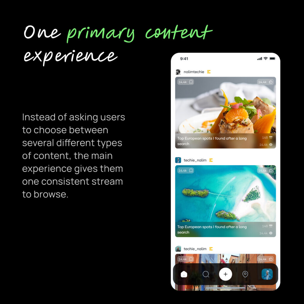
Home = Consumption
A focused feed built primarily around:
people you follow
lists you follow
creators you follow
recommendations introduced gradually
Recommendations were still present, but deliberately limited — roughly every third post.
The goal wasn’t to remove discovery.
It was to stop discovery from taking over the homepage.
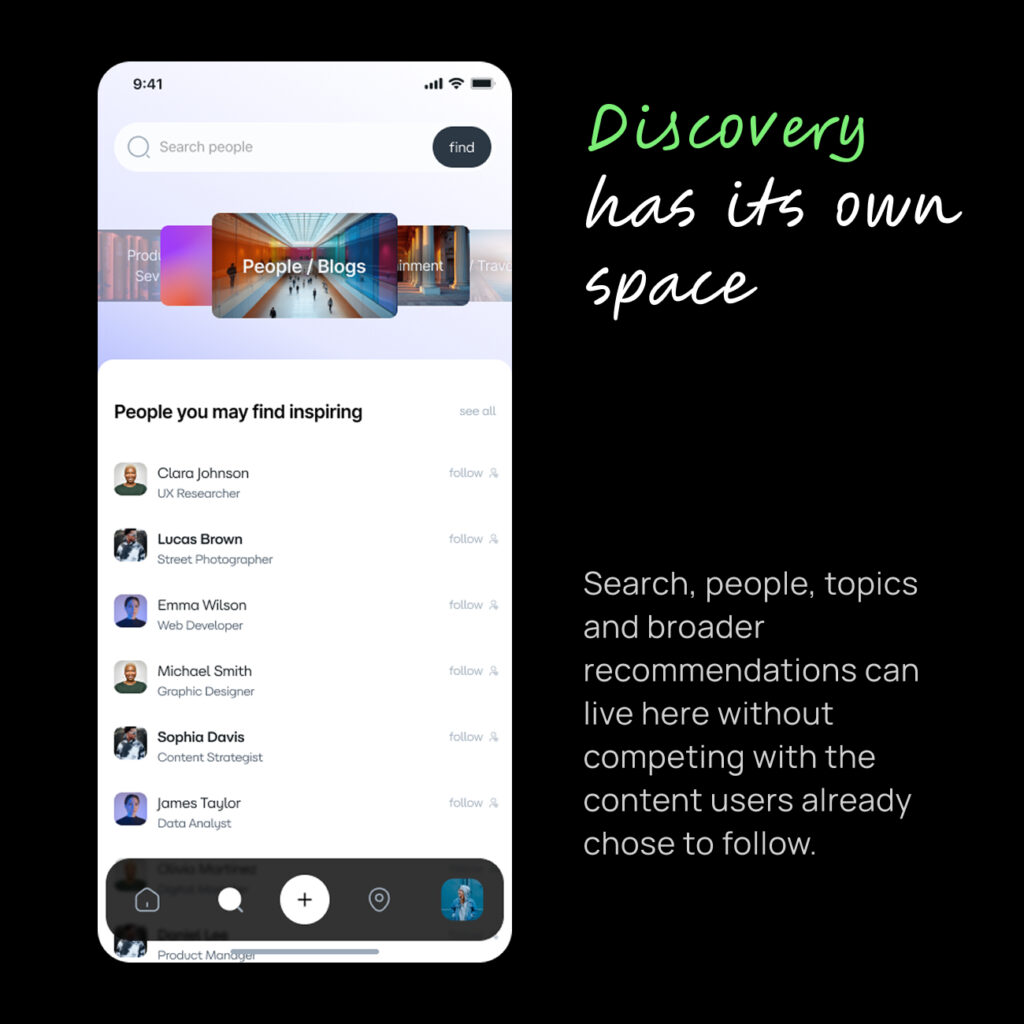
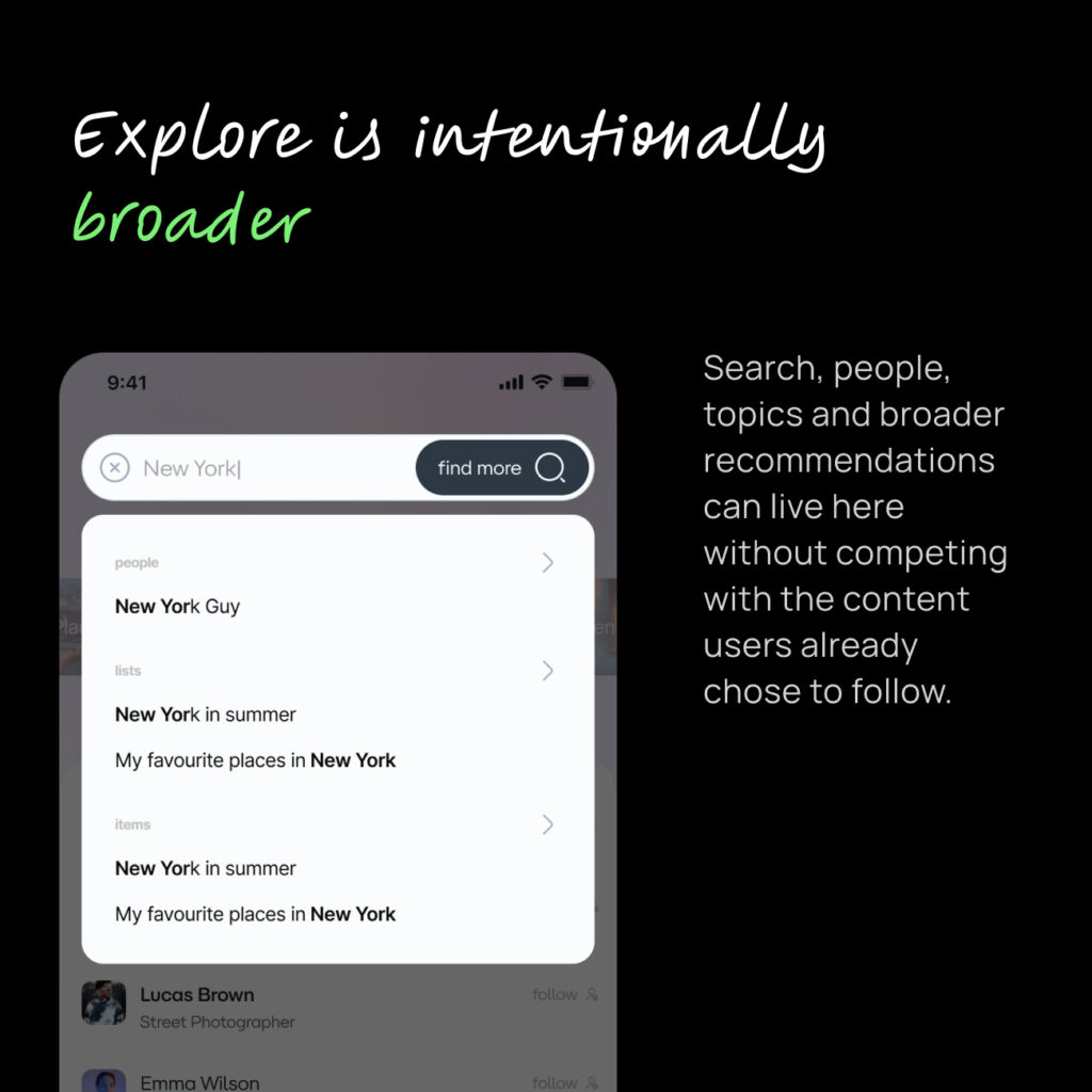
Explore = Discovery
Everything designed for discovery moved here:
recommendations
other posters and listers
search
topics
filters
global discovery
content you aren’t already connected to
This gave each surface a clear purpose.
04 / Progressive Experience
Teach the product gradually
Instead of throwing every content type at a new user, the experience could introduce Lysts progressively.
A user could start by seeing popular lists.
As they interacted with the product, listers could become more relevant.
Then individual items and other types of content could be introduced based on how they used the platform.
The idea was to let the product learn from the user while teaching the user how the product works.
This wasn’t just a visual change.
It changed how the homepage and recommendation system worked together.
05 / The New Experience
Home became simpler.
Instead of asking users to understand the entire Lysts ecosystem, it gave them one primary thing to do:
consume content relevant to them.
Then, when they wanted something else, Explore was there.
This also gave us a much clearer foundation for gradually introducing new types of content instead of presenting everything immediately.
The goal wasn’t simply:
“Show more relevant content.”
It was:
“Show the right amount of the right content at the right stage of the user’s experience.”
That distinction mattered.
06 / Outcome
The numbers moved. But they weren’t proof.
After the new homepage launched, Google Analytics showed significant increases across several engagement metrics compared with the previous measurement period.
There were also increases in views and engagement events.
But I couldn’t attribute the movement entirely to the homepage.
+69.7%
Engaged sessions per active user
+115.8%
Average engagement time per session
+253.3%
Average engagement time per active user
The homepage didn’t need more content. It needed a clearer job.
Marketing campaigns were running throughout this period, and the dataset also contained a significant number of fake users generated by an external marketing agency. That made it difficult to establish a clean before/after causal relationship.
There was another important limitation:
At this point, we didn’t yet have detailed product analytics or event-level tracking.
Most of the analysis was based on Google Analytics rather than a properly instrumented product funnel.
So I treated the results as a strong signal, not proof.
It’s easy to solve a growing product by adding more:
More content. More recommendations. More features. More ways to explore.
But sometimes the better product decision is to take things away.
The biggest change wasn’t a new UI component.
It was deciding that Home and Explore shouldn’t try to solve the same problem.
Once that distinction was clear, the information architecture, recommendation strategy and user journey became much easier to design around.
Killing email & pass signup
01 / The Problem
Despite downloads, many never reached the Aha moment.
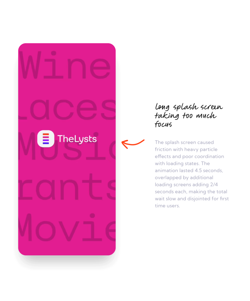
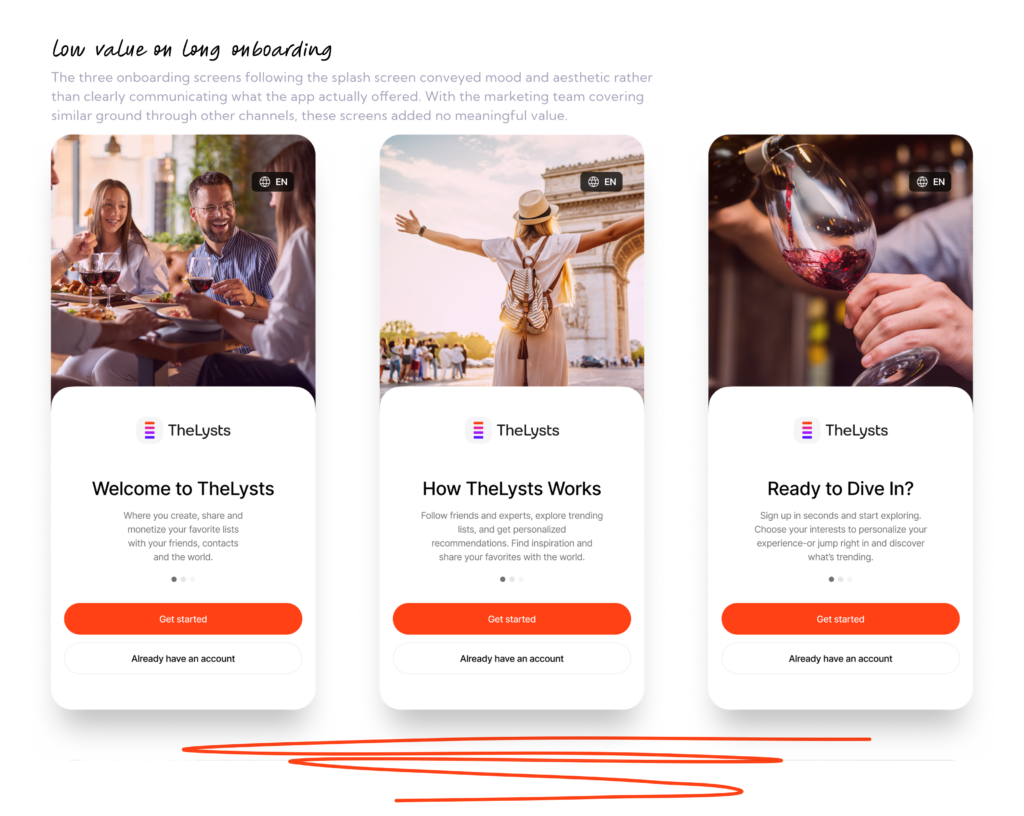
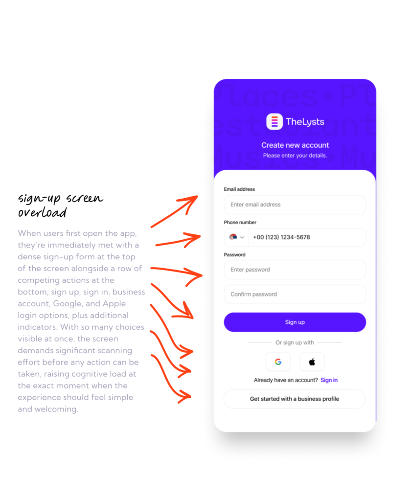
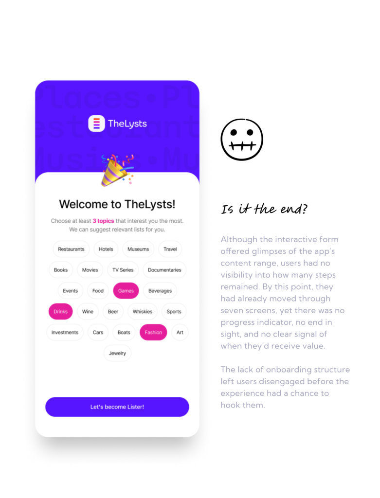
Before users could see a single list, they had to work their way through a long onboarding process. Security requirements, verification steps, and mandatory setup screens stood between users and the reason they downloaded the app in the first place.
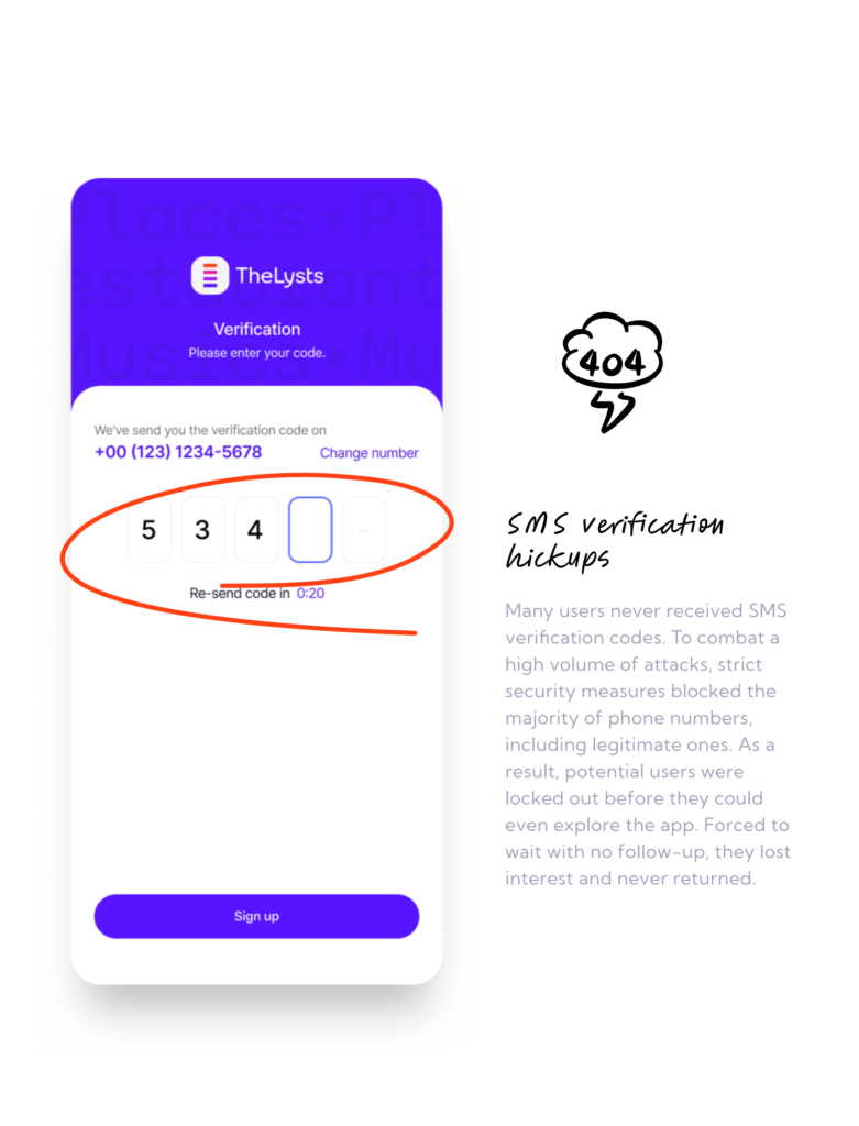
SMS verification frequently failed.
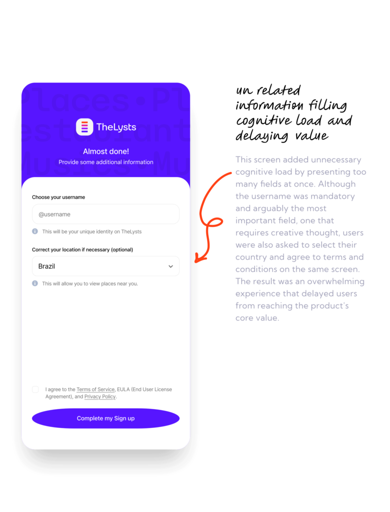
Mandatory setup steps delayed access.
Introductory screens provided little value.
Users did not know how much onboarding remained.
Too much time passed before users reached product value.
02 / Evidence
Before Redesign
Six screens showing the problematic onboarding experience — the friction users encountered before reaching any value.
03 / The Hypothesis
A Theory Worth Testing
My hypothesis was that users weren’t rejecting the platform, they simply weren’t reaching the moment where its value became clear. If we could reduce the path to first value, more users would continue into the experience.
The AHA moment happened when users discovered a list that resonated with them or realized they could start building their own. Unfortunately, onboarding was asking users to solve problems they didn’t come for (verification, setup, and configuration) before they could experience the reason they downloaded the app in the first place.
04 / The Decision
The Simplest Solution
Instead of optimizing individual screens, I redesigned the entire activation path around one principle: reduce the time between install and the first moment users could actually see and understand the product.
Strategy
Reduce the number of steps from 8 → 3
Remove SMS verification and rely on Google / Apple verification
Keep email / password only for existing accounts
Ask only for a username, then defer everything else until users experience value
05 / Redesign
After Redesign
Five screens showing the redesigned activation flow.
06 / Guardrails
What Needed to Happen
Success would be if:
I setup clear goals, if users completing onboarding
Smaller gap between installs and new users with 1st homepage view, not less than 40% in first month.
Also, we wanted to monitor active users and see if their activity went up after this changes, altho we knew we have to fix more issues in post-signup flow first.
Metric were defined sole by comparing effects we would get from campaigns.
Flop would be if:
On the other hand, killing the test would happened if we did not see any changes in downloads vs new users who saw the homepage gap grater than 10%. Gap was big and we knew it can be smaller.
If users continued abandoning before reaching the homepage In that scenario, the root cause would likely be elsewhere and we would do more live user testing.
07 / The Outcome
Success!
New users increased
Month over month on New users who saw homepage increased by almost 36%
Active users increase
Active users increased by 13.0%.
Compact onboarding
The onboarding journey was reduced from approximately 8 screens to 3. The results supported the original hypothesis: reducing activation friction helped more users reach the product experience.
AIceberg
Tenscope
TheLysts
Neat Pixel
Manage Consent
To provide the best experiences, we use technologies like cookies to store and/or access device information. Consenting to these technologies will allow us to process data such as browsing behavior or unique IDs on this site. Not consenting or withdrawing consent, may adversely affect certain features and functions.
Functional
Always active
The technical storage or access is strictly necessary for the legitimate purpose of enabling the use of a specific service explicitly requested by the subscriber or user, or for the sole purpose of carrying out the transmission of a communication over an electronic communications network.
Preferences
The technical storage or access is necessary for the legitimate purpose of storing preferences that are not requested by the subscriber or user.
Statistics
The technical storage or access that is used exclusively for statistical purposes.The technical storage or access that is used exclusively for anonymous statistical purposes. Without a subpoena, voluntary compliance on the part of your Internet Service Provider, or additional records from a third party, information stored or retrieved for this purpose alone cannot usually be used to identify you.
Marketing
The technical storage or access is required to create user profiles to send advertising, or to track the user on a website or across several websites for similar marketing purposes.