Ruining homepage to increase engagement
01 / The Problem
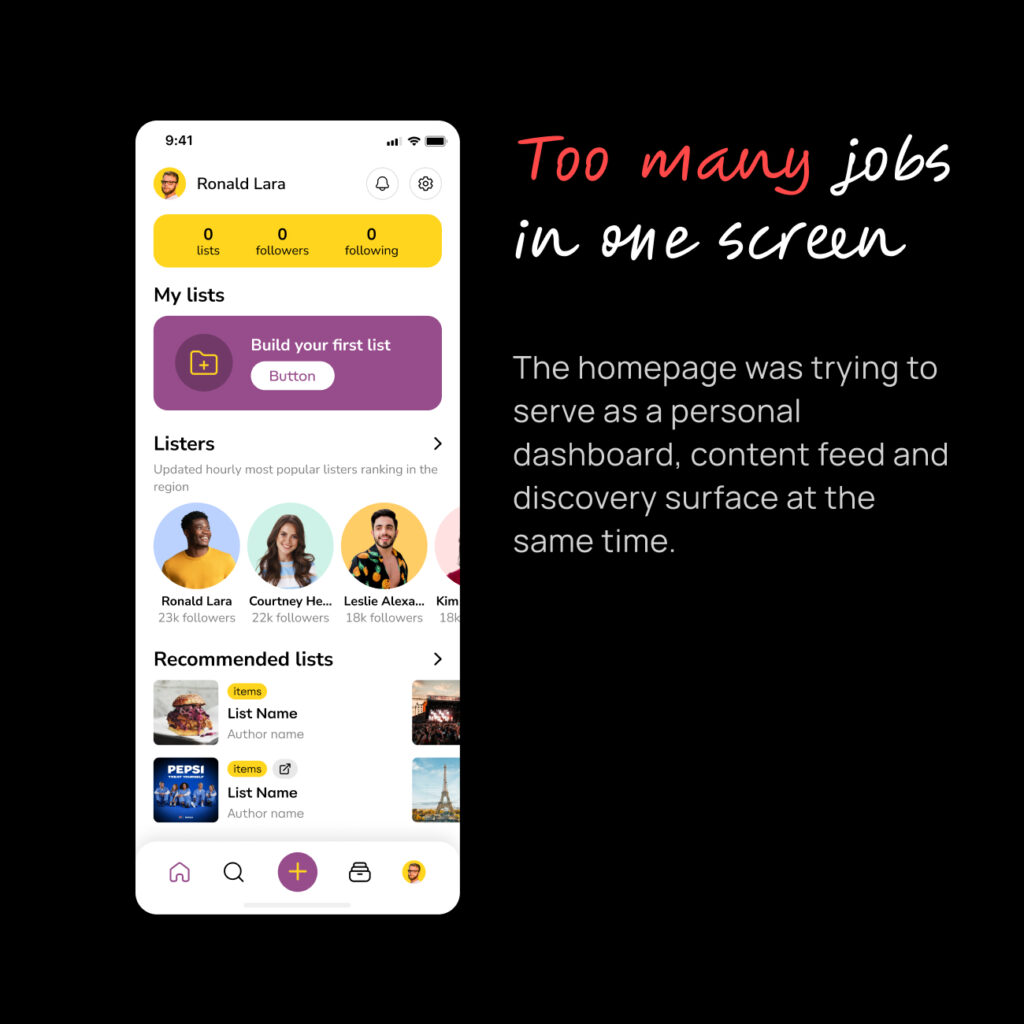
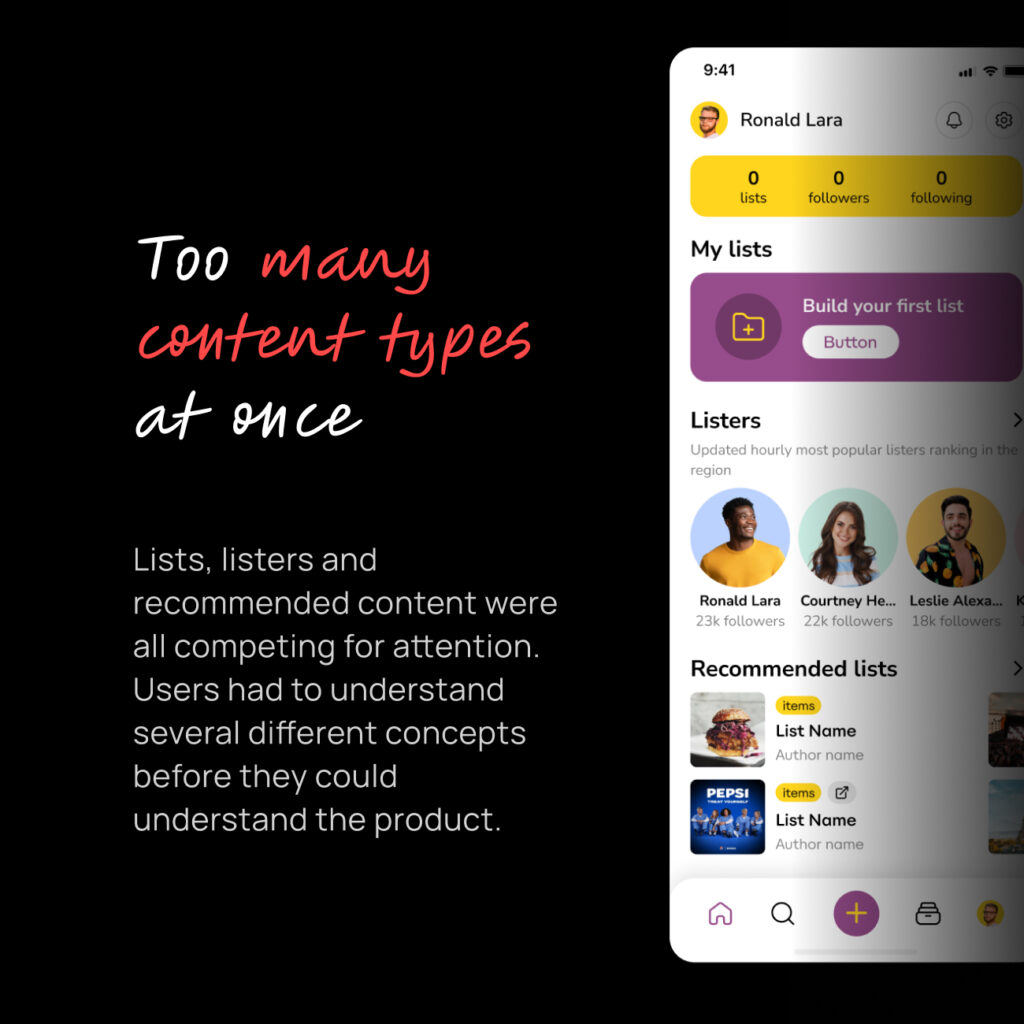
Everything was there. That was the problem.
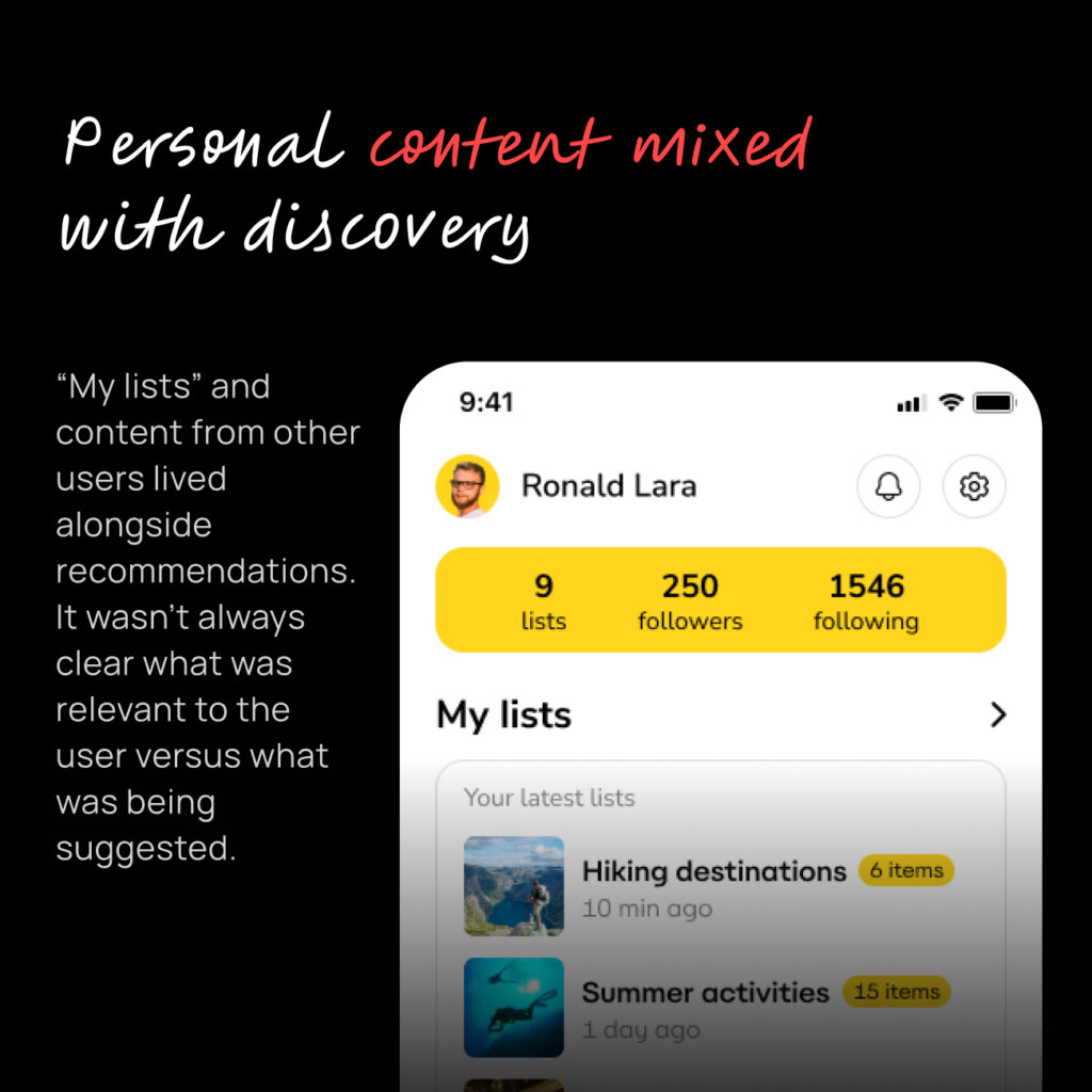
- content from people and lists you followed
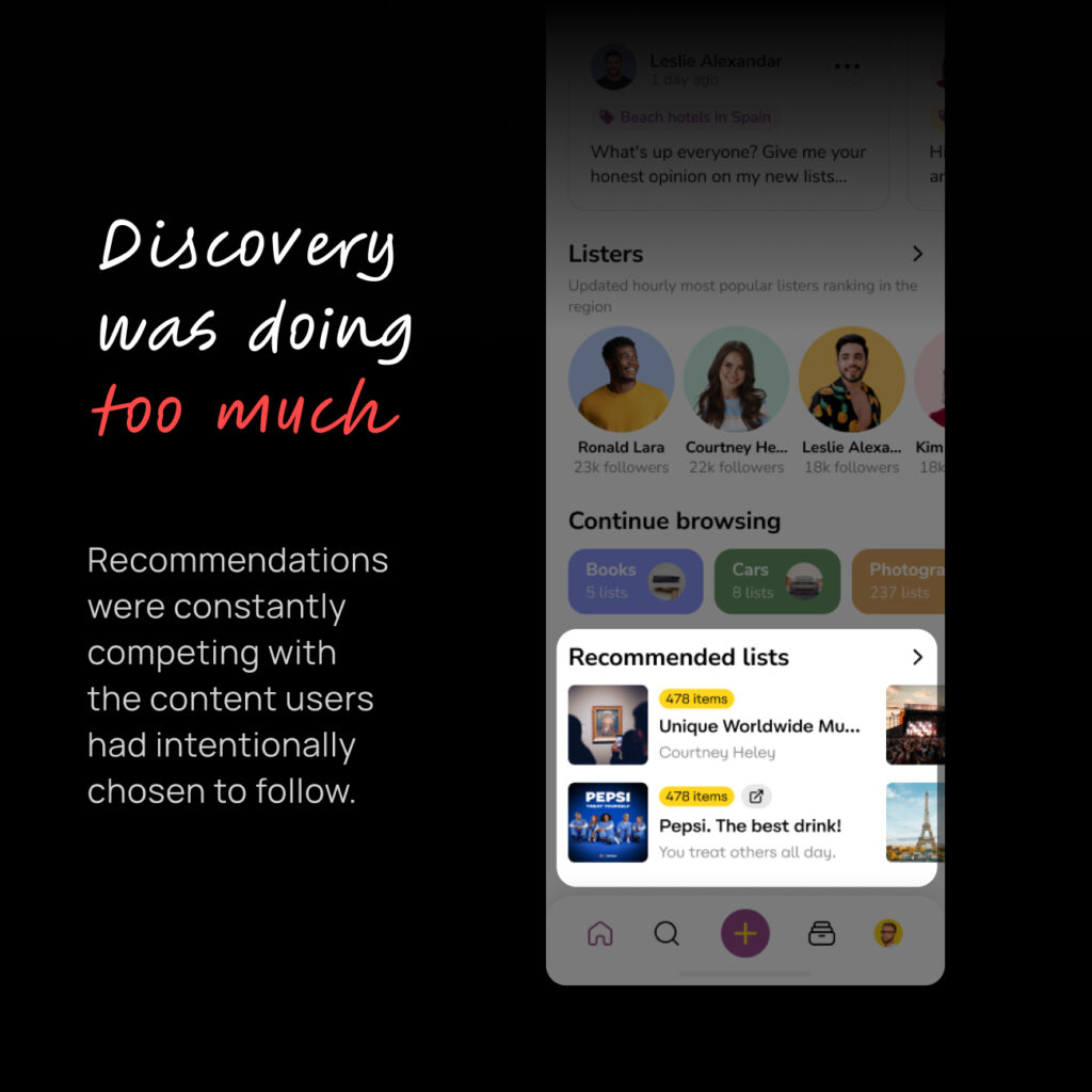
- recommendations
- your own content
- discovery
- search
- topics and filters
- different types of content
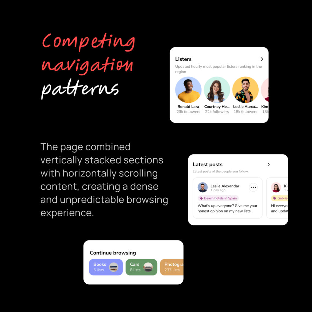
- horizontal and vertical scrolling
The Lysts homepage had grown into a place where users could do almost everything at once.
Nothing was necessarily wrong with any individual feature.
The problem was how they all worked together. Especially for users entering app for the first time. For them, seeing screen with multiple actions potentially can only leave question:
“What am I supposed to do here?”
Lysts was built around a simple idea:
Find recommendations. Save them. Build your own lists.
But the homepage wasn’t really teaching that idea. It was trying to expose the whole product instead.
02 / The Hypothesis
What if the homepage didn’t have to do everything?
I believed users would have a better experience if we separated two fundamentally different behaviors:
1. Consumption — seeing things from people and lists you already care about.
2. Discovery — finding everything else.
Instead of presenting both at the same time, we could give each one a clear place.
The hypothesis was simple:
If we make Home focused and predictable, users can understand it faster and discover the rest of Lysts when they’re ready.
03 / The Decision
Home for what you follow. Explore for everything else.
I proposed splitting the existing homepage into two experiences.
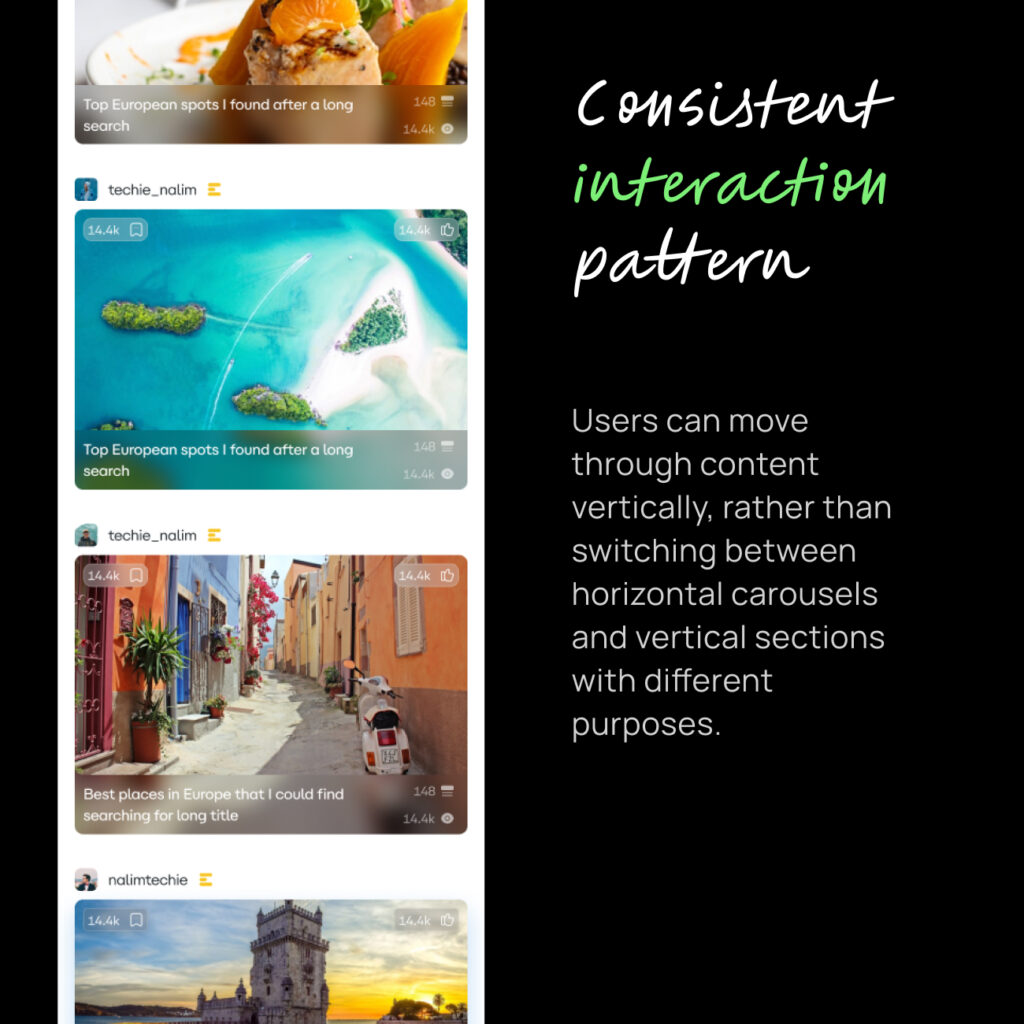
Home = Consumption
A focused feed built primarily around:
- people you follow
- lists you follow
- creators you follow
- recommendations introduced gradually
Recommendations were still present, but deliberately limited — roughly every third post.
The goal wasn’t to remove discovery.
It was to stop discovery from taking over the homepage.
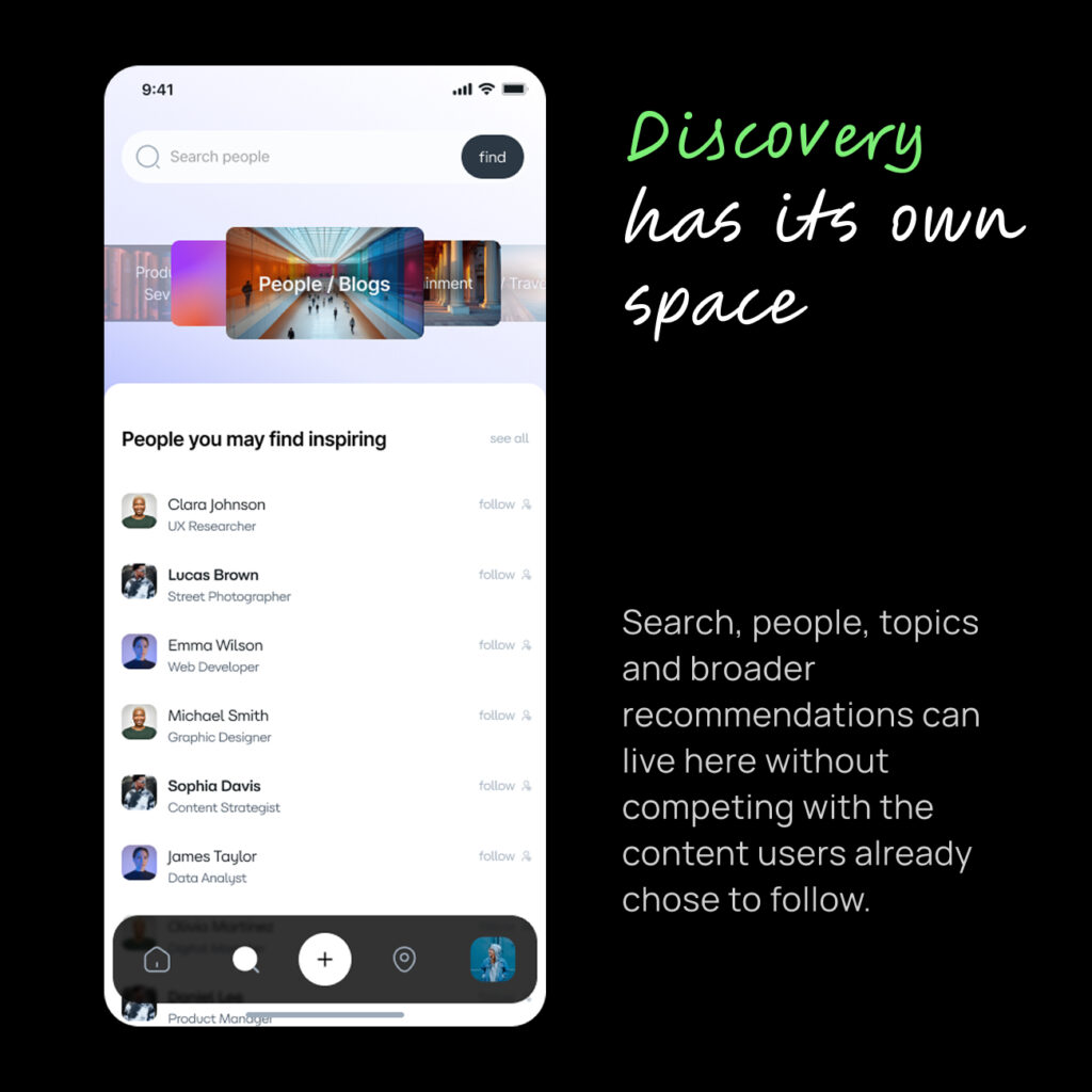
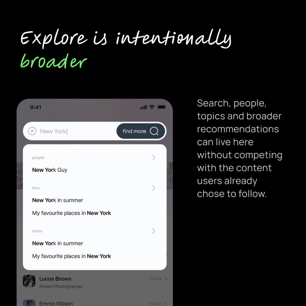
Explore = Discovery
Everything designed for discovery moved here:
- recommendations
- other posters and listers
- search
- topics
- filters
- global discovery
- content you aren’t already connected to
This gave each surface a clear purpose.
04 / Progressive Experience
Teach the product gradually
Instead of throwing every content type at a new user, the experience could introduce Lysts progressively.
A user could start by seeing popular lists.
As they interacted with the product, listers could become more relevant.
Then individual items and other types of content could be introduced based on how they used the platform.
The idea was to let the product learn from the user while teaching the user how the product works.
This wasn’t just a visual change.
It changed how the homepage and recommendation system worked together.
05 / The New Experience
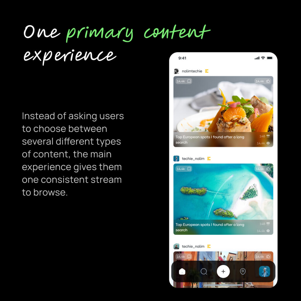
Home became simpler.
Instead of asking users to understand the entire Lysts ecosystem, it gave them one primary thing to do:
consume content relevant to them.
Then, when they wanted something else, Explore was there.
This also gave us a much clearer foundation for gradually introducing new types of content instead of presenting everything immediately.
The goal wasn’t simply:
“Show more relevant content.”
It was:
“Show the right amount of the right content at the right stage of the user’s experience.”
That distinction mattered.
06 / Outcome
The numbers moved. But they weren’t proof.
After the new homepage launched, Google Analytics showed significant increases across several engagement metrics compared with the previous measurement period.
There were also increases in views and engagement events.
But I couldn’t attribute the movement entirely to the homepage.
+69.7%
Engaged sessions per active user
+115.8%
Average engagement time per session
+253.3%
Average engagement time per active user
The homepage didn’t need more content. It needed a clearer job.
Marketing campaigns were running throughout this period, and the dataset also contained a significant number of fake users generated by an external marketing agency. That made it difficult to establish a clean before/after causal relationship.
There was another important limitation:
At this point, we didn’t yet have detailed product analytics or event-level tracking.
Most of the analysis was based on Google Analytics rather than a properly instrumented product funnel.
So I treated the results as a strong signal, not proof.
It’s easy to solve a growing product by adding more:
More content.
More recommendations.
More features.
More ways to explore.
But sometimes the better product decision is to take things away.
The biggest change wasn’t a new UI component.
It was deciding that Home and Explore shouldn’t try to solve the same problem.
Once that distinction was clear, the information architecture, recommendation strategy and user journey became much easier to design around.